As a result of inflation-fueled price increases, dollar sales for grocery items were up in 2023… but unit sales dropped. Consumers, feeling the pinch, were being mindful of every dollar they spent. Now that inflation is cooling — and will likely continue to cool throughout the year — food producers will need to shift their emphasis toward increasing unit sales to retain market share and keep their shareholders happy.
Food suppliers rely on packaging, product placement and in-store displays to attract attention to their products in an effort to gain market share, increase unit sales and boost their profits. As a grocer, there are several effective strategies you can use in-store to help drive sales.
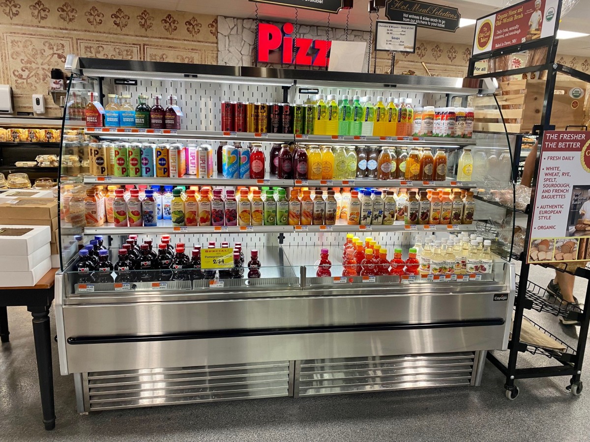
1: Eye-catching visuals — Consider using colorful signage, banners or posters with compelling visuals to draw attention to the display. You can add custom touches to many of our display cases, making them stand out to customers — like devoting one of our plug-in refrigerated cases to all things pizza!
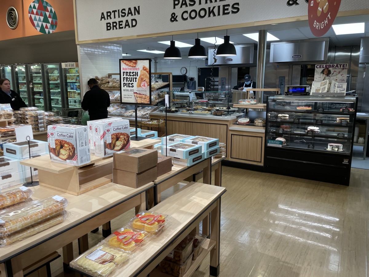
2: Product grouping — Grouping related products together to encourage impulse purchases. For example, display bakery items and condiments on a self-service display next to a full-service deli case.
3: Limited-time offers — Highlight discounts, special deals or bundle offers prominently to create a sense of urgency and encourage immediate purchases. This is especially effective when placed in market tables or bins right by the cash registers.
4: Engage shoppers — Shoppers love interacting with products before they buy. Providing product samples, cooking demonstrations or recipe cards that showcase the versatility and appeal of the products helps drive sales. Sampling is particularly effective, since it triggers a feeling of reciprocity in the minds of shoppers.
5: Seasonal and holiday-themed displays — Displays that align with seasonal or holiday themes, such as back-to-school, summer grilling and festive holidays, help shoppers connect emotionally with the products, encouraging them to make seasonal purchases.
Since the nature of such displays is fluid, having display cases that are flexible — such as our nesting tables, market bins and wing tables — makes showcasing seasonal products a simple process. For more detailed information, see our post, “Creating Flexible & Exciting Seasonal Displays”.
6: Educate and inform — Displays can be used to provide clear and concise product information. Use signage or labels to highlight key features, nutritional benefits or unique selling points. By educating shoppers, you make it easier for them to make decisions, which can lead to increased sales.
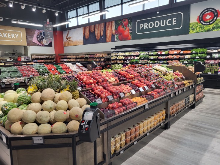
For a great example of this, check out the case study for Freson Bros’ Rabbit Hill location.
7: Proper stocking and rotation — Displays that are organized and well-stocked signify abundance, making the products displayed more desirable — empty shelves are a real turn-off and create a negative experience for shoppers.
Choose displays that are easy for employees to maintain, restock products and rotate them to maintain freshness — like our multi-tier and narrow multi-shelf tables. The latter is particularly useful for stores with limited stock and/or a small footprint.
8: Location, location, location — Position displays in high-traffic areas and near complementary products or popular sections. Placing displays at the end of aisles or near checkout counters can capture shoppers' attention and encourage impulse purchases.
Choose displays that are flexible and easy to move around so you can take advantage of special sales, promotions and seasonal opportunities.
Using design elements to boost unit sales
Certain design elements can be used to attract attention to the products in your store’s display cases, in some instances even elevating them to make them feel like luxury brands. Here are a few examples.
Color — Display cases often incorporate bright and vibrant colors to capture shoppers' attention. Eye-catching hues like red, yellow, or orange are commonly used to create visual impact and stand out among other displays.
Lighting — Strategically positioned lighting can highlight specific items, create contrast and make the products within visually appealing. Consider the color and temperature of the lights in your store and how they contribute to the overall atmosphere. Have the choices you’ve made encourage people to buy or walk away?
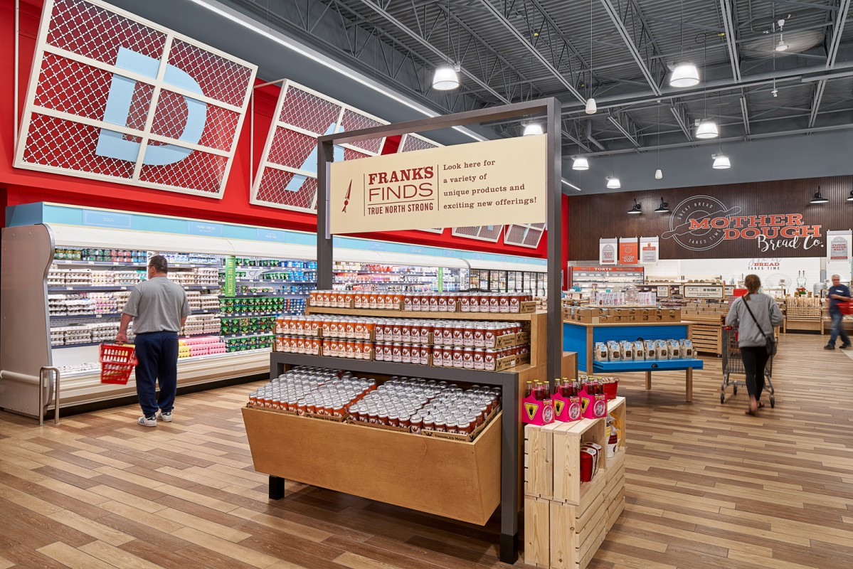
Signage — The use of bold, easy-to-read fonts, along with appropriate graphics, help shoppers quickly understand the offerings, prices or special deals associated with the products.
Branding — Brand logos, colors, and imagery can be integrated into the display’s design to create a consistent visual identity, reinforcing brand recognition and loyalty. All of our cases can be custom-built to suit any decor or branding needs.
Shelving — The design of the shelving and organization within the display case plays a significant role in grabbing attention. Using different levels, angles, or interesting shapes for product placement can make the display visually dynamic and visually appealing — check out the display we created for Freson Bros’ store-made honey!
By incorporating these design elements, grocery store display cases can effectively attract attention, create visual appeal and entice shoppers to explore the products further. The goal is to make the display stand out among the array of options available, grab shoppers' interest and drive sales.
Elevate your customer’s experience to increase unit sales
At Cayuga, our retail food displays are thoughtfully designed to delight customers, bringing your brand to life and increasing in-store sales — all within your budget and timelines.
We specialize in display fixtures for fresh departments, refrigerated displays for service & self-service and hot & cold food bars designed with the latest technology — all to help you create an unforgettable experience for your customers.
If you’re thinking of upgrading a single department, transforming your entire store or just have a question or two, contact us to book a free consultation.
We’d love to hear from you and are always happy to help!


